Global Automotive Trends


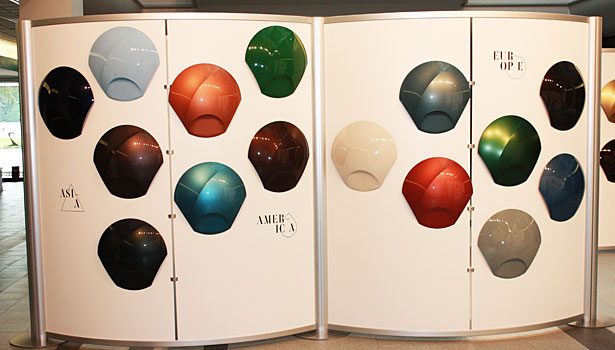
This year’s event was titled Wide Awake. It focused on three global themes, each of which has a specific call to action. The first theme is Invent, and it suggests that in order to have more stewardship for our environment we need to invent and create new ways of doing things. We need to modify materials, use non-traditional combinations and be more creative with the space that we use. BASF translated this inventive spirit into intensive new colors with bolder effects and different sheens of matte. With dark berries, intense browns and coppers, along with radiant emeralds, BASF designers anticipate powerful color experiences on the roads.
The second theme is Narrate, and the idea is to have a new way to tell your story. Automotive colors say a lot about the people who drive the cars. Black suggests power, yellow, a happy attitude, and red exudes confidence. Metallic cars have a more luxurious feel, and non-metallic or matte finishes are more utilitarian. BASF has introduced a family of colors that tell a new story – they take an innovative spin on traditional colors in both metallic and non-metallic finishes. Some samples look both metallic and matte at the same time, depending on the angle shift on the car body.
Cultivate is the third theme. With a fast-paced world, ever-changing technology and environmental concerns, the call to action is to be nurturing and patient – to take care of the things of this world. BASF has developed earth tones, coppers, greens and even sky blue to coincide with this theme.
In addition to these global concepts, BASF introduced regional themes for North America, Europe, Asia and China. In North America, we are coping with the fluctuating economy, the health care crisis, natural disasters and debt. The trend here is to go back to a time of more stability and simplicity, so the regional North America colors have a more retro, 1950s look. The trend in Europe is to take images and substances that don’t normally go together and combine them, so the colors for this region are somewhat different and unexpected. In Asia, the focus is on the individual, so the colors are vibrant and stand out. The colors developed for China reflect the local market and its evolution to more interest in color. Vivid hues are balanced with metallic effects that bring increased prominence to this growing segment. As China continues to establish itself as a huge global market, there is a wide gamut of color, all of which combine to say, “I’m here.”
There were some beautiful and unique colors and sheens introduced at this show. Visit PCI’s website to view photos of the themes and regions that were on display.


