Understanding Color Communicaton
Your perception and interpretation of color are highly subjective. Eye fatigue, age and other physiological factors can influence your color perception.
But even without such physical considerations, each observer interprets color based on personal references. Each person also verbally defines an object's color differently.
As a result, objectively communicating a particular color to someone without some type of standard is difficult. There also must be a way to compare one color to the next with accuracy.
The solution is a measuring instrument that explicitly identifies a color. That is, an instrument that differentiates a color from all others and assigns it a numeric value.
Ways to Measure Color
Today, the most commonly used instruments for measuring color are spectrophotometers. Spectro technology measures reflected or transmitted light at many points on the visual spectrum, which results in a curve. Since the curve of each color is as unique as a signature or fingerprint, the curve is an excellent tool for identifying, specifying and matching color.The instrumentation and communication of color data is as important as the color data itself. Throughout the supply chain, different suppliers may use different processes and equipment for color formulation and quality assurance, making compatibility an essential component. X-Rite products are designed for integration and compatibility throughout the supply chain. For example, a large installation may use integrated, networked color formulation and quality assurance software, such as the Color(r) Master and several sphere instruments throughout the shop. A small supplier with a QA-Master I installed on a single computer and one SP62 spectrophotometer will be compatible with the larger installation.
The following offers an understanding of which instrument is the best choice for specific applications.
Spherical
Spherically based instruments have played a major roll in formulation systems for nearly 50 years. Most are capable of including the "specular component" (gloss) while measuring. By opening a small trap door in the sphere, the specular component is excluded from the measurement. In most cases, databases for color formulation are more accurate when this component is a part of the measurement. Spherical instruments are also the instrument of choice when the sample is textured, rough, or irregular or approaches the brilliance of a first-surface mirror. Textile manufacturers, makers of roofing tiles or acoustic ceiling materials would all likely select spheres as the right tool for the job.0/45 (or 45/0)
No instrument "sees" color more like the human eye than the 0/45. This simply is because a viewer does everything in his or her power to exclude the specular component (gloss) when judging color. When we look at pictures in a glossy magazine, we arrange ourselves so that the gloss does not reflect back to the eye. A 0/45 instrument, more effectively than any other, will remove gloss from the measurement and measure the appearance of the sample exactly as the human eye would see it.Multi-Angle
In the past 10 or so years, carmakers have experimented with special effect colors. Additives such as mica, pearlescent materials, ground up seashells, microscopically coated colored pigments and interference pigments are used to produce different colors at different angles of view. Large and expensive goniometers were traditionally used to measure these colors until a battery-powered, hand-held, multi-angle instrument was introduced. X-Rite portable multi-angle instruments are used by most automakers and their colorant supply chain worldwide.Colorimeter
Colorimeters are not spectrophotometers. Colorimeters are tristimulus (three-filtered) devices that make use of red, green and blue filters that emulate the response of the human eye to light and color. In some quality-control applications, these tools can be the least expensive. Colorimeters cannot compensate for metamerism (a shift in the appearance of a sample due to the light used to illuminate the surface). As colorimeters use a single type of light (such as incandescent or pulsed xenon) and because they do not record the spectral reflectance of the media, they cannot predict this shift. Spectrophotometers can compensate for this shift, making them a better choice for accurate, repeatable color measurement.Attributes of Color
Each color has its own distinct appearance, based on three elements: hue, chroma and value (lightness). By describing a color using these three attributes, you can accurately identify a particular color and distinguish it from any other.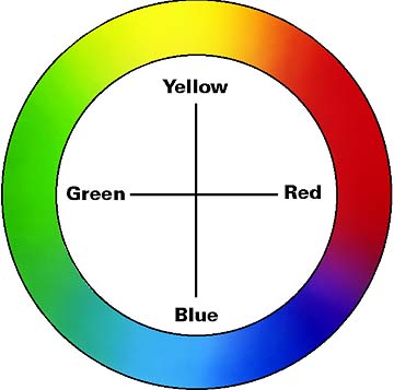
Hue
When asked to identify the color of an object, you'll most likely speak first of its hue. Quite simply, hue is how we perceive an object's color - red, orange, green, blue, etc. The color wheel in Figure 1 shows the continuum of color from one hue to the next. As the wheel illustrates, if you were to mix blue and green paints, you would get blue-green. Add yellow to green for yellow-green, and so on.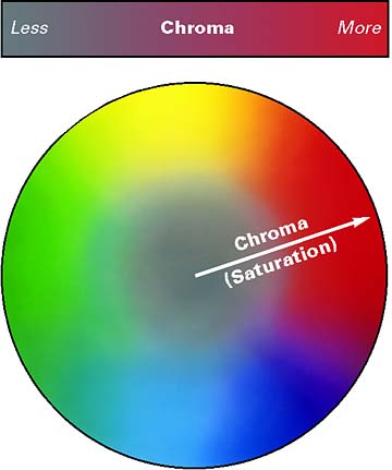
Chroma
Chroma describes the vividness or dullness of a color - in other words, how close the color is to either gray or the pure hue. For example, think of the appearance of a tomato and a radish. The red of the tomato is vivid, while the radish appears duller.
Figure 2 shows how chroma changes as we move from center to the perimeter. Colors in the center are gray (dull) and become more saturated (vivid) as they move toward the perimeter. Chroma also is known as saturation.
Lightness
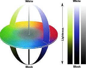
The luminous intensity of a color - i.e., its degree of lightness - is called its value. Colors can be classified as light or dark when comparing their value.
For example, when a tomato and a radish are placed side by side, the red of the tomato appears to be much lighter. In contrast, the radish has a darker red value. In Figure 3, the value, or lightness, characteristic is represented on the vertical axis.
Scales for Measuring Color
The Munsell Scale
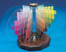
In 1905, artist Albert H. Munsell originated a color ordering system - or color scale - that is still used today. The Munsell System of Color Notation is significant from a historical perspective because it's based on human perception. Moreover, it was devised before instrumentation was available for measuring and specifying color. The Munsell System assigns numerical values to the three properties of color: hue, value and chroma. Adjacent color samples represent equal intervals of visual perception.Figure 4 depicts the Munsell Color Tree, which provides physical samples for judging visual color. Today's color systems rely on instruments that use mathematics to help us judge color.
Three things are necessary to see color: a light source (illuminant), an object (sample), and an observer/processor.
As humans, we see color because our eyes process the interaction of light hitting an object. What if we replace our eyes with an instrument - can it see and record the same color differences that our eyes detect?
CIE Color Systems
The CIE, or Commission Internationale de l'Eclairage (translated as the International Commission on Illumination), is the body responsible for international recommendations for photometry and colorimetry. In 1931 the CIE standardized color order systems by specifying the light source (or illuminants), the observer and the methodology used to derive values for describing color.The CIE Color Systems use three coordinates to locate a color in a color space. These color spaces include CIE XYZ, CIE L*a*b* and CIE L*C*h?. To obtain these values, we must understand how they are calculated.
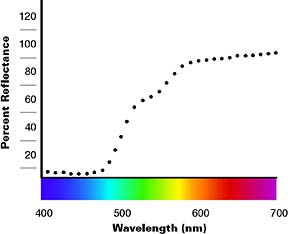
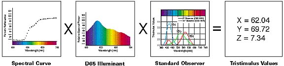
As stated, our eyes need three things to see color: a light source, an object and an observer/processor. The same must be true for instruments to see color. Color measurement instruments receive color the same way our eyes do - by gathering and filtering the wavelengths of light reflected from an object. The instrument perceives the reflected light wavelengths as numeric values. These values are recorded as points across the visible spectrum and are called spectral data. Spectral data is represented as a spectral curve. This curve is the color's fingerprint (see Figure 5).
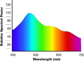
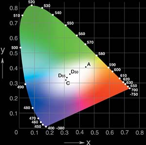
Once we obtain a color's reflectance curve, we can apply mathematics to map the color onto a color space. To do this, we take the reflectance curve and multiply the data by a CIE standard illuminant. The illuminant is a graphical representation of the light source under which the samples are viewed. Each light source has a power distribution that affects how we see color. Examples of different illuminants are A - incandescent, D65 - daylight (see Figure 6) and F2 - fluorescent.
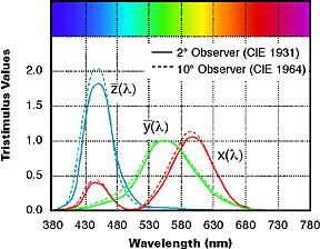
We multiply the result of this calculation by the CIE standard observer. The CIE commissioned work in 1931 and 1964 to derive the concept of a standard observer, which is based on the average human response to wavelengths of light (see Figure 7).
In short, the standard observer represents how an average person sees color across the visible spectrum. Once these values are calculated, we convert the data into the tristimulus values of XYZ (see Figure 8). These values can now identify a color numerically.
Chromaticity Values
Tristimulus values, unfortunately, have limited use as color specifications because they correlate poorly with visual attributes. While Y relates to value (lightness), X and Z do not correlate to hue and chroma.As a result, when the 1931 CIE standard observer was established, the commission recommended using the chromaticity coordinates xyz. These coordinates are used to form the chromaticity diagram in Figure 9. The notation Yxy specifies colors by identifying value (Y) and the color as viewed in the chromaticity diagram (x,y).
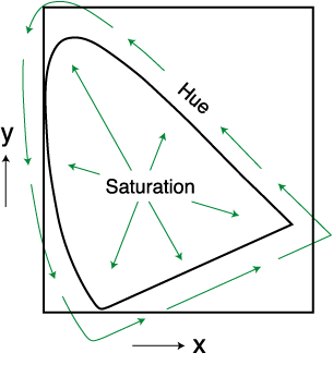
As Figure 10 shows, hue is represented at all points around the perimeter of the chromaticity diagram. Chroma, or saturation, is represented by a movement from the central white (neutral) area out toward the diagram's perimeter, where 100% saturation equals pure hue.
Expressing Colors Numerically
To overcome the limitations of chromaticity diagrams like Yxy, the CIE recommended two alternate, uniform color scales: CIE 1976 (L*a*b*) or CIELAB, and CIELCH (L*C*h?).
These color scales are based on the opponent-colors theory of color vision, which says that two colors cannot be both green and red at the same time, nor blue and yellow at the same time. As a result, single values can be used to describe the red/green and the yellow/blue attributes.
CIELAB (L*a*b*)
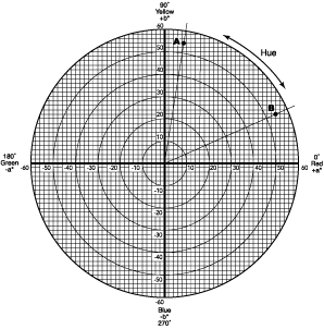
When a color is expressed in CIELAB, L* defines lightness, a* denotes the red/green value and b* the yellow/blue value.Figures 11-12 show the color-plotting diagrams for L*a*b*. The a* axis runs from left to right. A color measurement movement in the +a direction depicts a shift toward red. Along the b* axis, +b movement represents a shift toward yellow. The center L* axis shows L = 0 (black or total absorption) at the bottom. At the center of this plane is neutral or gray.
To demonstrate how the L*a*b* values represent the specific colors of Flowers A and B, their values have been plotted on the CIELAB Color Chart in Figure 11. A and B intersect at color spaces identified respectively as points A and B. These points specify each flower's hue (color) and chroma (vividness/dullness). When their L* values (degree of lightness) are added in Figure 12, the final color of each flower is obtained.
Color Differences, Notation and Tolerancing
Delta CIELAB
Assessment of color is more than a numeric expression. Usually it's an assessment of the color difference (delta) from a known standard. CIELAB is used to compare the colors of two objects. The expressions for these color differences are DL* Da* Db* or DL* Da* Db* (D or D symbolizes "delta," which indicates difference).Given DL* Da* Db*, the total difference or distance on the CIELAB diagram can be stated as a single value, known as DE*.
E*ab = [(DL2) + (Da2) + (Db2)]1/2
CIE Color Space Notation
DL* = difference in lightness/darkness value + = lighter - = darkerDa* = difference on red/green axis + = redder - = greener
Db* = difference on yellow/blue axis + = yellower - = bluer
DE* = total color difference value
Refer to Figure 11.
For more information on color, contact X Rite, phone 800/248.9748; fax 616/534.8960; visit www.x-rite.com; or e-mail info@x-rite.com
Applications
Spectrophotometry's applications are seemingly boundless. Color-matching measurements are made every day by those comparing a reproduced object to a reference point.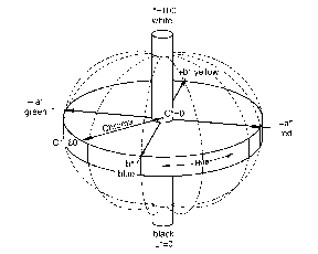
- Corporate logo standardization
Color testing of inks
Color control of paints
Control of printed colors on packaging material and labels
Color control of plastics and textiles throughout the development and manufacturing process
Finished products like printed cans, clothing, shoes, automobile components, plastic components of all types.
Links
Looking for a reprint of this article?
From high-res PDFs to custom plaques, order your copy today!


