Clariant Unveils Decorative Color Trends for 2021


MUTTENZ, Switzerland – As 2020 has seen people spend more time in their homes, there has been a growing interest in decorating and re-imagining how people want their living, and now working, environments to look and feel. Clariant’s latest “New Freedom” Decorative Color Trends 2021, is full of creative colors to capture imaginations.
At a time people are adjusting to the new normal, these colors provide the freedom to discover what is important, the freedom to do something creative, and the freedom to focus on making homes cozy environments where people feel happy and at ease.
Global color institutions, interior designers and Clariant’s operating customers who have their fingers on the design pulse provided inspiration for the palette of 13 different trendsetting tones.
The colors for 2021 are creating spaces that have more than a positive emotional impact. They have all been formulated with Clariant’s Hostatint 500 range, multi-purpose pigment preparations with low VOC and no APEO.They are binder-free and deliver technical design freedom in water- and solvent-based modern decorative paints.
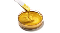
“It’s well known that colors can reflect and influence our emotions and well-being, so we have chosen bright warm and neutral color shades in our latest collection to help create spaces that have a positive impact,” said Franziska Hammerl, Segment Head Decorative and Wood Coatings, Global Technical Marketing Coatings at Clariant. “One stunning 2021 color, for example, is Meraki, Greek for an outburst of dedication, an intense red. Another is Ubuntu, a Nguni Bantu term meaning ‘humanity.’ It’s a warm, intense yellow that reflects a bond of sharing, connecting all of humanity, and seems particularly relevant today.”
These bold shades are ideal for color blocking – an interior design trend here to stay. It may have started on the fashion catwalks but the pairing of different solid colors and textures, to boldly segment space in our homes, continues to be a much used decorating tactic.
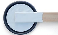
Clariant has also nominated a color of the year included in the “New Freedom” Decorative Color Trend palette. Wabi-Sabi gray, with soft violet undertones, is inspired by Japanese aesthetics and the concept of appreciating the beauty found in the imperfections of nature. It is an imperfect gray that can be combined perfectly with any other color.
Looking for a reprint of this article?
From high-res PDFs to custom plaques, order your copy today!


