New Pigments, New Colors, New Designs


Without the existence of specialized rods and cones inside the human eye, the world around us would be a much duller place. Without color, a key component of our visible experience would be lost and entire industries would be flushed away or dramatically altered, including interior and graphic design, clothing retail, advertising and especially the manufacturing of paints and coatings. Thankfully, this isn’t the world we live in, and the vibrancy of colorful pigments is an experience that most of us are able to take for granted in our everyday lives.
Starting from Indigo, Now We’re Here
Historically, clothing dyes and paints were only as good as the natural materials available. Different colors came from different sources that included exotic plants, insects, aquatic life and more. Blue was derived from the indigo plant (and still is), red from the insect kermes, and so forth.
Today, it takes far more than mixing a few pigments derived from these sources to create a color that both visually resonates and stands the test of time. Through the architectural coating development process, art and science are melded to accomplish marvels. Unlike the blue dye that washes out from your jeans, advanced metal coatings maintain a vivid finish that is durable, sustainable and spectacular to view.
When designing innovative products in any industry, new methods and resources are tested to determine what will advance the product most efficiently, sustainably and economically. For years, architectural metal coating manufacturers have been able to produce all the colors within the rainbow and countless more with varying results, but as technology and understanding of pigments and resins increase, new coatings and never-before-seen colors have begun to spring up. One of the primary reasons these new innovations are beginning to take off is due to the technology that allows for the use of intense pigments that maintain a coating’s strength and durability, which broadens the available range of colors and innovative effects offered by manufacturers.
Color palettes and design schemes have swiftly become more culturally relevant because of social media, especially Pinterest and Instagram. The pervasiveness of these image-based platforms causes color preferences among architects and homeowners to continually change, producing tastes and preferences and increasing consumer demand along the way. This forces the chemistry makeup of coatings to advance quickly enough to meet demand, and in many cases, try to precede it. This is where color selection takes place.
What’s on the Inside?
Before we get to how color is determined, it is important to consider what makes up a metal coating. PVDF resin-based coatings come in two coating application processes – coil and extrusion. Coil-coated, or pre-painted, exterior metal products begin as flat sheets that are later shaped into different applications, such as roof panels, wall panels, gutters and more.
In the coil coating method, the coating is applied to the metal sheet prior to it being shaped into an architectural building product. Conversely, the aluminum extrusion process spray applies the finish after the product is formed. The shape of the die determines the shape of the extrusion. Implementing aluminum billets and hydraulic presses, extruders can manufacture any shape an architect requests. The most common forms of these products include extruded aluminum, which involves window framing, curtainwall, storefront and entrance systems.
Once a metal panel is prepped or a product formed, the architectural metal coating can now take center stage. To develop these high-performance PVDF coatings, manufacturers implement unique formulations that incorporate the use of resins, pigments, solvents and additives. Although all of the ingredients are important to the final outcome, pigments are the ingredients that make the biggest impact. Not only are they used to add color and aesthetic properties, pigments also influence the coating’s durability, making it one of the most important properties, as it lends to both the visual and practical functionality of a product.
Pigments come in different forms – inorganic (ceramic), organic and what is commonly referred to as pearlescent. These variations can dictate appearance, durability and the overall quality of a coating, and are invaluable to the progress of the industry.
- Organic pigments are natural and very bright in appearance, but have a low resistance to fading and weather poorly on their own. Despite achieving dynamic colors, these pigments will often have difficulty standing up to sunlight, moisture and temperature changes.
- Inorganic (ceramic) pigments are made of metal oxides and mixed metal oxides that have high resistance to fade and are excellent in protecting against weathering agents. Although they can last for many years, most coatings that are comprised primarily of inorganic pigments are less bright, more earth-tone colors.
- Pearlescent (metalescent) pigments are primarily composed of minute flakes of aluminum, natural mica or synthetic, mica-like material. These pigments add shimmer and sparkle to a finish, and can even shift the color of a coating depending on the lighting and what angle the viewer is standing at when looking at the coating.
These three types of pigments make up the majority of coating formulations and can dictate the colors, vibrancy, durability and aesthetic quality of a finished product. Through variance of pigments and additional coating ingredients, many innovative coating technologies and colors are created.
A Thousand Shades of Blue
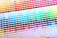
Think back to the last time you entered your local hardware store. Among the boxes of nails and light bulbs you have likely found yourself in the paint aisle - marked by rows of endless color swatches. Although you may not have a preference between Ocean Radiance and Blue Jay Crest, trust us when we say there is a color for everyone. At Valspar, we take pride in our dedication and obsession with color, and have a team of color strategists that select the next set of trend-setting pigments.
Whether it’s the latest trend seen on HGTV or a company deciding what color will adorn their building’s exterior, coatings and paint can affect the entire personality, mood and feel of an exterior or interior space. With the ever-evolving preferences of architects, home builders and interior designers, we must focus on how to determine trends before they happen, and how we’ll meet the rising diversity in color needs each and every year.
To begin, we conduct all-encompassing research on which pigments are growing in popularity, where trends are going and which colors customers are ultimately hoping to add to their end designs. But for each region, there may be a unique shade of blue that fits the bill. It is important to develop a deep understanding of the end user in different areas in order to introduce the specific colors that will suit them best.
While color trends are a huge focus across the industry, we also know that nothing will outsell classic, neutral colors, so it is important to introduce new hues at a relatively conservative speed – about 20 percent of the total color offering. With a more conservative introduction, we can more accurately assess the impact each new color offering makes in a market, and be sure we’re providing the correct shades and pigments to the right customers.
The Selection
The importance of pigments doesn’t just stay with the manufacturer; selecting a color to adorn the exterior of a new building can have a lasting impact. Choosing the perfect pigment can help define or ruin the visible purpose of a structure, and in turn the brand. The pigments of a coating can have a profound impact on a building or business, and it is vital to choose the product that conveys the right message and tone.
Consider a school and the impact colors can have on its students. Physical environments can have a powerful psycho-physiological impact on students, so it is important for designers to use color in a way that injects fun and warmth into the building. With the right application of color, a school can create environments conducive to effective learning and a comfortable space that promotes good physical and mental health.
In another facet, the right pigment makeup of a coating can change the outlook and trust that people have with businesses like a bank or healthcare facility. Selecting a strong and warm color can play an important role in viewing a business as competent, efficient and caring. But select the wrong color or palette, and the opposite could be true. For hospitals, comforting tones and calming color combinations can enhance healing processes, inspire confidence in care and provide an environment more comforting for patients going through difficult times.
Through educated application of color, architects can create more human, user-supportive environments. Each tenant and business owner is unique and will bring a specific personality to a space – both internally and externally. This is important to consider when selecting the coating color for a building’s façade, as facilities often house multiple businesses over time and bring with it a branding overhaul. This is why we often recommend selecting a standard neutral color to occupy the majority of the space, and function similarly to an artist’s canvas. With the effective use of selective accent colors and light, a building can function for multiple uses and more easily undergo renovations to accommodate color and branding changes as needed.
At the end of the day, color selection all comes down to preference. Luckily for building developers and architects, the technology of pigments and coating formulations provides them with nearly anything they can dream up. Despite the many current innovations, it won’t be long before the next technological advancement unlocks another generation of pigments and coatings, leading building design and style to a whole other level.
Looking for a reprint of this article?
From high-res PDFs to custom plaques, order your copy today!


